Customer
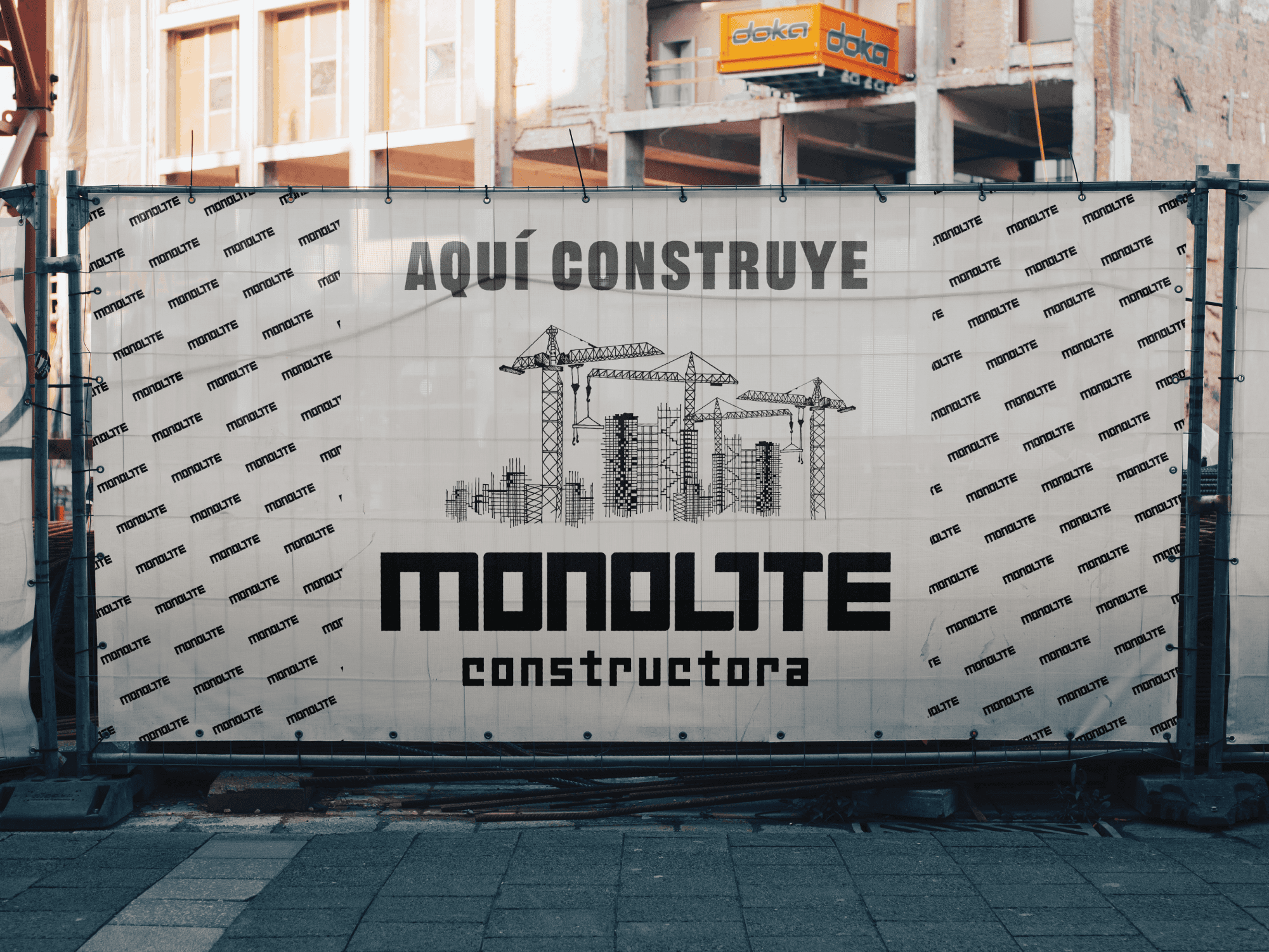
MONOLITE CONSTRUCTORA
Summary
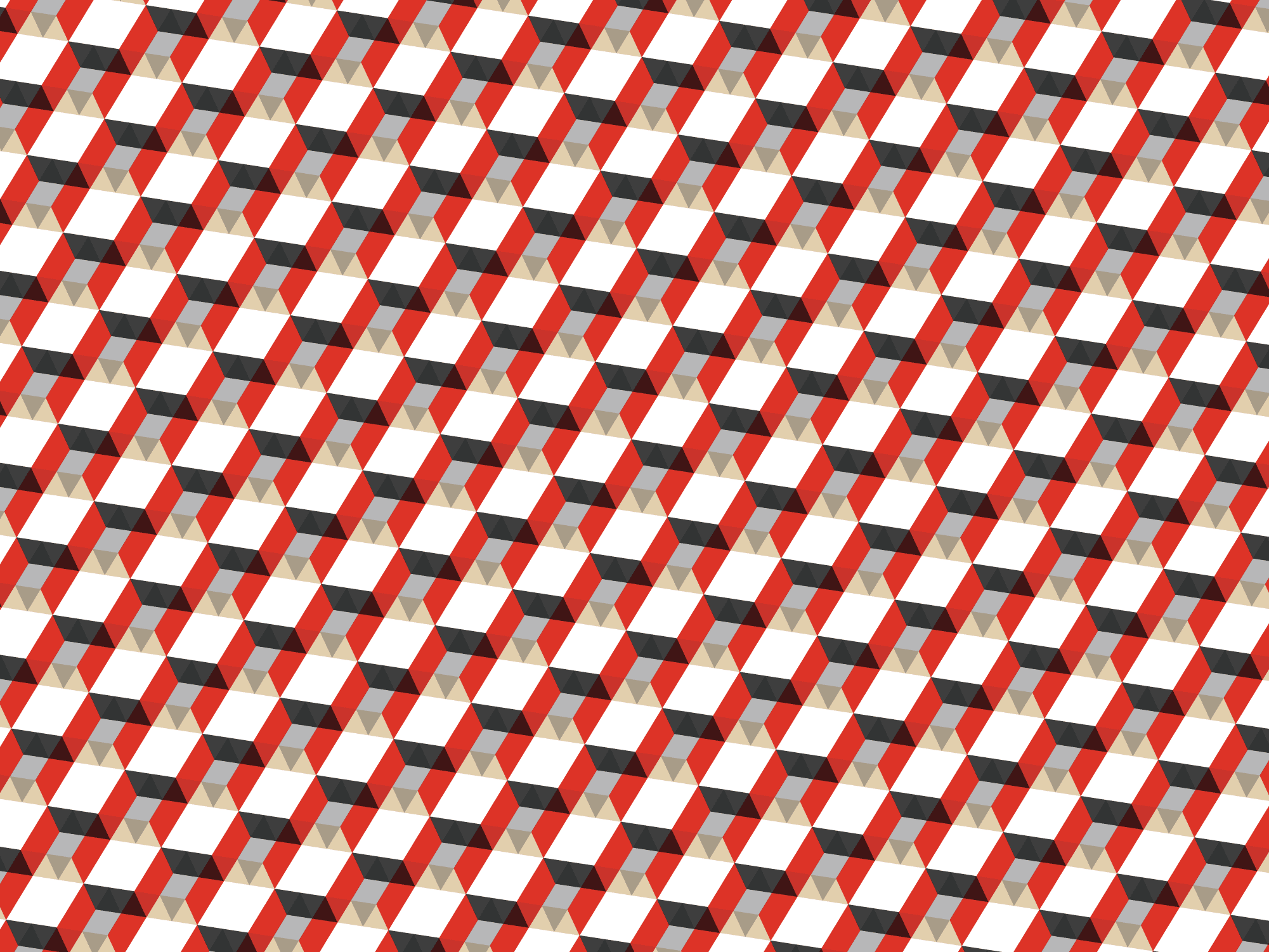
In the construction world, the first impression is also built. 🏗️ For Monolite Constructora, I developed a strong, minimalist, and timeless visual identity inspired by brutalism: bold geometric shapes, modular typography, and a palette that conveys strength, confidence, and experience.
Customer
MONOLITE CONSTRUCTORA
Industry
Construction
Service
Branding
Web Development
Digital Design
Duration
6 weeks


The Challenge
Monolite Constructora needed a visual identity that conveyed history, professionalism, and reliability, values that are part of its DNA. The challenge was to ensure that these attributes were reflected in a solid and timeless brand, while also being distinctive within a sector where generic and forgettable identities predominate. The new identity needed to work both in traditional pieces (signage, stationery) and in digital environments (social media, brand applications), ensuring consistency and recognition across all points of contact.

The Solution
Inspired by brutalist aesthetics, I developed a brand based on simple and bold geometric shapes, with a modular and solid typography that conveys firmness and permanence. The color palette combines: Red, symbolizing energy and passion. Gray, evoking concrete and technical expertise. Beige, adding warmth and closeness. This approach allowed for the construction of an identity that honors the tradition of brutalist architecture while visually encoding the values of Monolite: order, efficiency, reliability, and trajectory.
The Result
A visual identity that is perceived as strong as the structures built by the studio. The branding positions Monolite as a serious, professional company ready to grow, consolidating its place in a competitive market and generating a first impression that is also built.


PORTFOLIO

Macondo Grow shop
Macondo Grow shop
Macondo Grow shop
Branding and Identity
Happycats
Happycats
Happycats
Brand Identity
Social Media
Digital Design